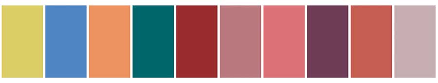
Here we go again, it’s color season! The buzz of new announcements are in the air, and we can’t get enough of the color inspiration lighting up fashion and design. New York Fashion Week set the stage, with Pantone dropping the 2026 palette. It’s fresh and full of romantic flair.
The Palette
Laurie Pressman from the Pantone Color Institute says the colors chosen offer the chance to find…
“Freedom to redefine color usage, this season’s palette contrasts warm familiar shades with more vibrant, stimulating colors and foundational tones.”
This palette flips the script of what we’ve seen in the past. Bold reds, lively pinks, and dreamy purples are the main focus, while the usual blues, greens, and yellows take a back seat. Watching color evolve feels like a thrilling adventure, full of surprises waiting to be discovered.
Classic Neutral
Alongside the main palette, Pantone introduces a set of timeless classics, commonly referred to as the neutral palette. While these shades serve as foundational tones, Pantone frequently adds a few bold statements to keep things fresh.

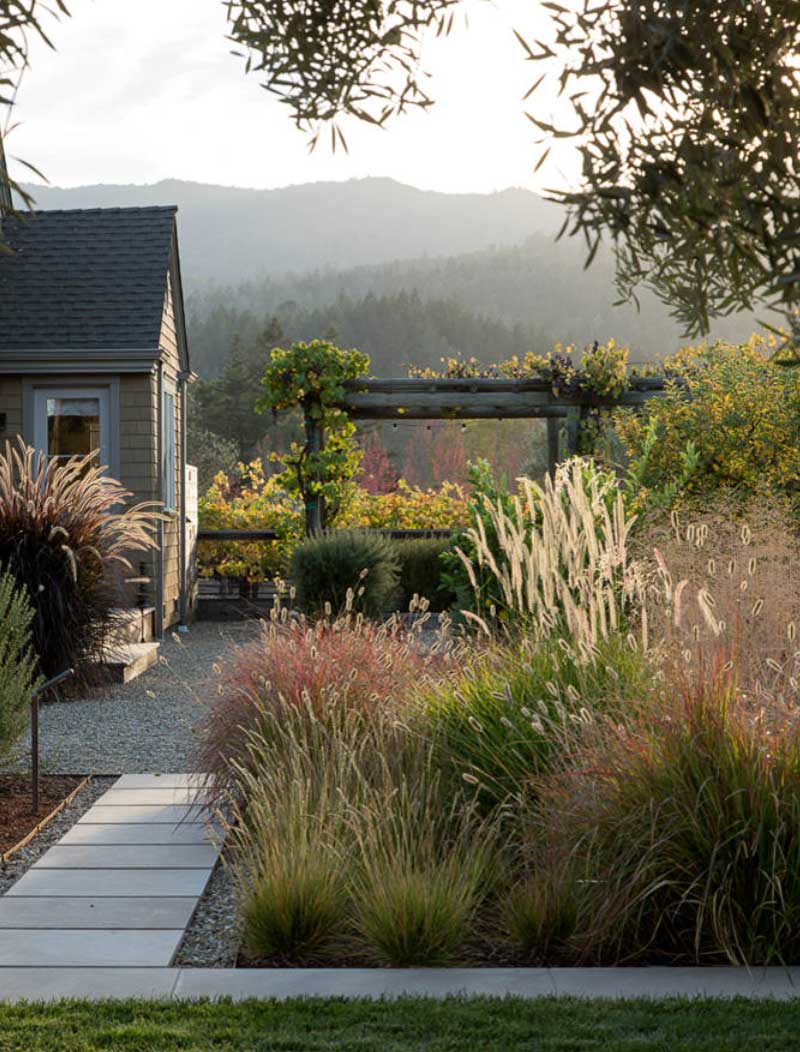
This Year’s Color Inspiration
We’ve always believed that nature holds the best color inspiration, and this year’s picks prove it once again. Inspired by dreamy landscapes, the classic palette feels soft and mellow, yet still full of depth and personality. It’s the perfect mix for pairing colors in a fresh and creative way. Let’s dive into how these shades are making their mark in home design.
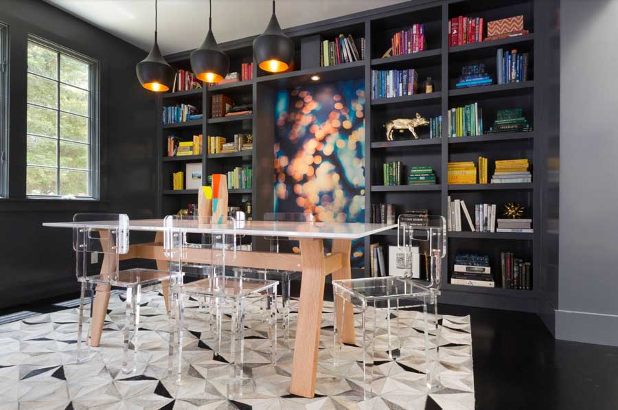
The Dining Room Deserves a Fresh Look
This dining room is anything but ordinary. With striking black built-ins and a geometric rug in soft neutrals, this is the ultimate showcase of what could be. The real magic comes from the bold color accents. Pops of red, blue, yellow, and green burst from the artwork at the center, bringing energy and personality to the space. If this year’s palette is about self-expression, this room has it mastered. After all, what better place for color, conversation, and creativity than the dining room?
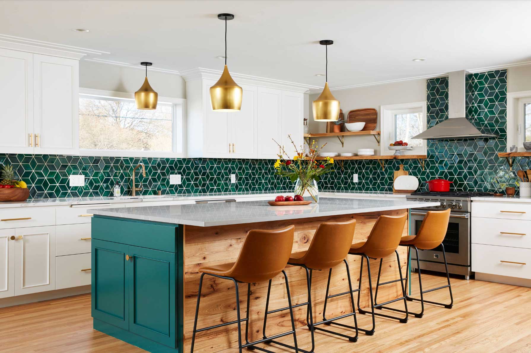
Cook Up Beautiful Design
A white kitchen is timeless. It’s always crisp, clean, and full of light. But why stop there? The accents are where the fun begins. This year’s star, Alexandrite, brings a bold pop of color into the kitchen that’s vibrant, enchanting, and guaranteed to add that “wow” factor to your space.
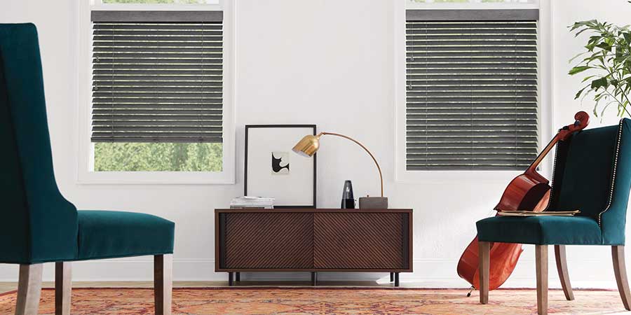
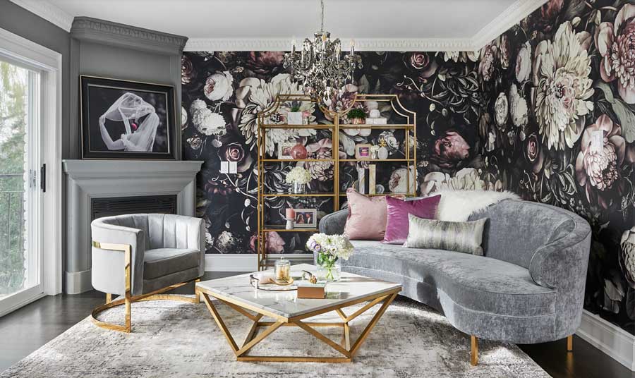
Living Room Romance
There’s definitely a romantic vibe in this year’s color story. Maybe because half the palette is all about passion? Bold reds, flirty pinks, and dreamy purples are stealing the spotlight. So why not let them turn heads in your home, too? Picture yourself winding down in this living room. Do you have a living room design wish list?
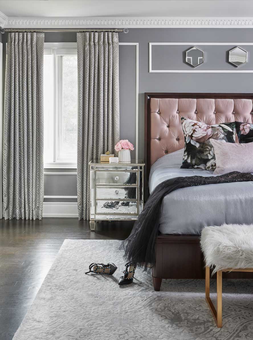
Sweet Bedroom Dreams
Turn your primary bedroom into a true sanctuary with the power of color. A calming gray sets the stage, while dusty rose pillows and upholstery add just the right touch of warmth and charm. Drift off each night in total comfort, wrapped in a dreamy bedroom design made just for you.
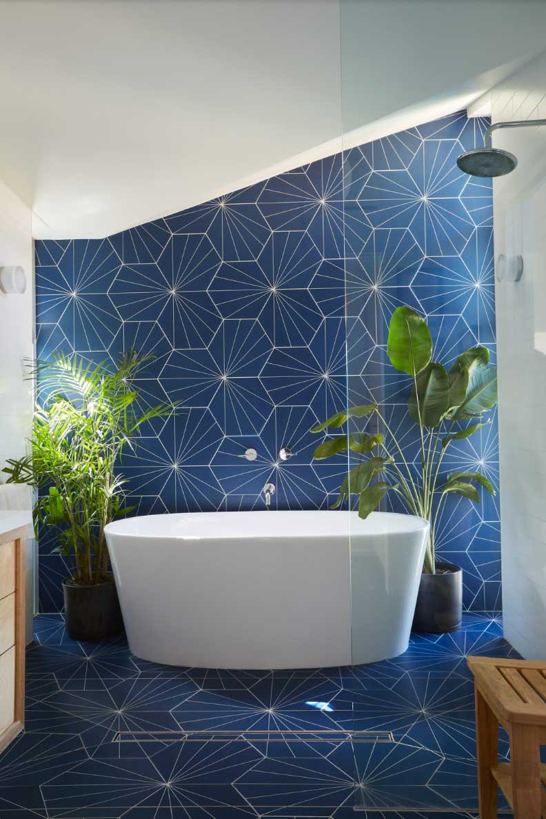
Bathroom Refresh
Bathrooms are unique where anything can go! A splash of unexpected color or a bold geometric pattern can make the space entirely your own, without dominating the rest of the home. Every morning, stepping in feels like a mini getaway, a little bathroom design adventure before your day even begins.
Feeling That Color Inspiration?
This year’s palette is extraordinary, and we are looking forward to how it will be showcased by the design world. Surrounding yourself with color inspiration can unlock so many new ways of expressing yourself and feeling truly unique. And that first step starts in your home. It’s the place you spend valuable time in so bring the atmosphere, style, and solutions all together with window coverings. Come visit one of our showrooms to see and touch the products to find what inspires you. Or, contact the Creative Blinds team for your free in-home design consultation. Let’s add some color to your world!