Following in the steps of New York Fashion Week, we must admit that the Pantone Color Institute’s top ten color palette for 2024 is providing us with a great deal of inspiration. As we love the vibrant hues, we also want to admire the five classic palette choices. Interested in learning more about the latest color trends and how they are finding their way into home decor? Let’s get started!
Up and Coming Colors
Colors evolve with time, and it’s clear that a cultural movement impacts this greatly. For 2024’s colors, the palette is described as optimistic and lively. Known for inspiring freedom and personalization, there is a definite vibe that comes from these bright colors.
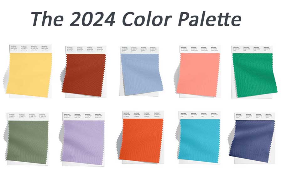
When you think of self-expression in interior design, you may think of bright colors that showcase one’s personality. They are energetic and powerful! However, you may find yourself loving the calmness that accompanies neutral colors and look forward to incorporating these into your home. Take a look at the five classic colors of 2024.

The classic palette highlights colors that shine a light on a minor dilemma that most homeowners feel when picking out colors. They may wonder, “I love grays but I want the warmth of browns in my home” or vice versa. The great thing is that you can utilize both cool and warm tones in your home. Say goodbye to choosing just one and pick them both!
Say Hello to Color
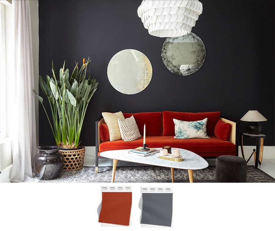
Neutral colors are a comfort to many of us. Over the last decade, interior design has shifted from color, and neutrals have become common. In some instances, it can feel like something is missing. Will patterns and splashes of color help make your home feel more you? Well, there is one way to find out! Start incorporating small pops of color in your spaces. Examples include pillows, blankets, artwork, or vases. Play around with color and then see if you want to take bigger leaps. You may find yourself ready for a makeover and start painting your walls a bold hue, adding colorful furniture or patterned window treatments.
Creating a Calming Space
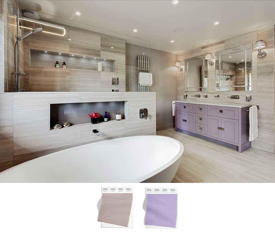
Picture it. You’re trying to establish your master bathroom as a place that is calming and peaceful. But, you’d also love to make a unique statement. This neutral space is the perfect backdrop for a vanity that highlights your personal style, while also pairing nicely with the “quiet vibe” of this bathroom. Pairing the colors lilac and mushroom is an excellent example of how harmony can be created when colors are brought together in the same space. Using neutral colors for the tub, fireplace, walls, and floors establishes this room as a calming respite in your home.
Pair Colors that Pop
Pairing colors in design comes down to one thing: Which color families do YOU like to see together? Pick colors that appeal to you. Take this home office as an example. You may not instinctively think, “Hey, what if I put these two colors together?” Well, pairing colors that pop make an eye-catching statement. A fun thing to note is that one of the colors will always hold the majority of the space while the other will accent certain areas.
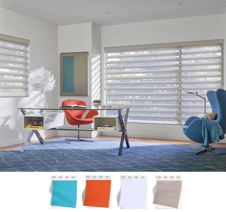
Once you have pinpointed the colors for your space, consider how window treatments will fit in with the design. While the decor accents and furniture stand out, we recommend finding a color that complements the neutral tones of the room. Pirouette shades are a perfect option for this room as they easily complement the walls as well as the neutral flooring.
The Wow Effect
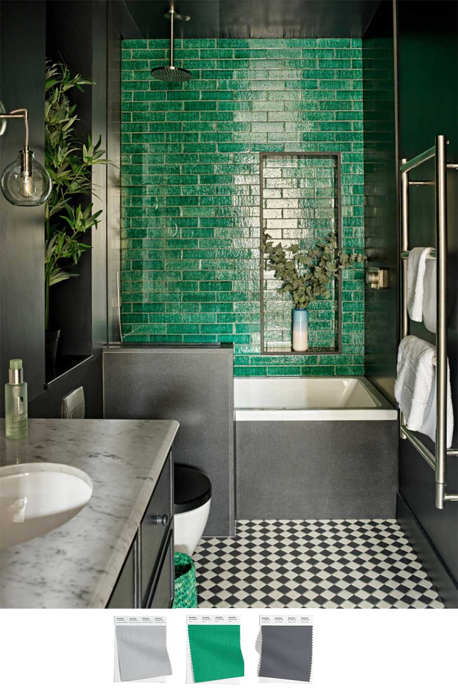
Color families are made for everyone. Adding an accent wall can take a room to the next level. The latest color trends focus on self-expression so why not incorporate that into your bathroom? The layers of gray are neutral and dark enough to highlight the accent tiles on the back wall. While the black and white tile may seem like a bold choice on its own, they complete the subway tile beautifully and bring the space together effortlessly.
The Style of Your Home
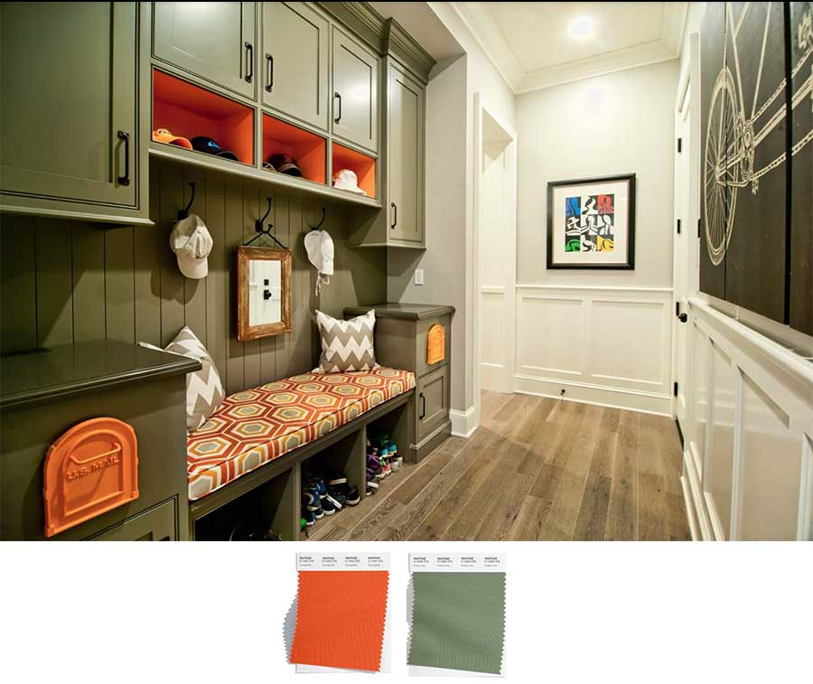
Your home is where you return after a long day. Designing all areas of your home to showcase colors that make you happy is a must. The latest color trends encourage incorporating color that mean something to you. It could be through the hues you use in your mudroom, or small nooks throughout the house. Painting the cubbies a bright color that complements the cushions and artwork is a great way to showcase personality and make areas of the home engaging.
Latest Color Trends: Finding Inspiration
As you start to explore adding the latest color trends into your home, remember that window coverings are the art of the window! They help invite color, dimension, and texture into your space. If you are curious about how they can fit into your home, contact our team today! You can schedule a free consultation and our team of designers will help make your visions a reality.
